5 Rules of Photography Composition
I love learning how to properly compose a photograph. The more I learn about it, the better my photos will look. I honestly don’t think there is an exact right way to compose a photo, because everyone’s tastes are different and not everyone likes the same style. This lesson we learned five completely different ways to compose a photograph, so there is definitely something for everyone!
This post contains affiliate links. I may earn commission from qualifying purchases at no additional cost to you. I will never recommend a product I don’t use or trust.
#1: Dominant Subject
As the name states, your subject should dominate the photograph. There are two ways you can accomplish this:
- Make your subject larger than life, or
- Make your subject larger than other elements in the photo
For this photo, I decided that I wanted to make the castle larger than life. It’s one of my favorite ways to photograph the castle because this is the way you look at it if you were actually there!
f/stop: 4
shutter speed: 1/13
ISO: 1600
mode: Manual
lens: 20mm f/2.8
# 2: Rule of Thirds
I’m calling this my rockin’ rule of thirds photograph. We love this ride, so I’m always trying to find new ways to photograph the area around it.
The rule of thirds is one of my favorite ways to compose photographs. Here is the definition No Bad Foto gives us for what it is:
“The Rule of Thirds is one of the most popular composition rules of photography and it involves dividing your frame into thirds vertically and horizontally and the points where the lines intersect are the areas the have the most aesthetic quality. Placing your subject within these areas is recommended.”
You can also read more about the rule of thirds in a guest post Madison from Wetherills Say I Do wrote for me!
f/stop: 2.8
shutter speed: 1/200
ISO: 100
mode: Manual
lens: 20mm f/2.8
#3: Focus on your subject
To focus your viewers attention on your subject, you should use shallow depth of field creates negative space by blurring out the background. That helps isolate your main subject (in this case, my husband) and draws your attention to him.
f/stop:2.8
shutter speed: 1/200
ISO: 400
mode: Manual
lens: 20mm f/2.8
#4: Framing
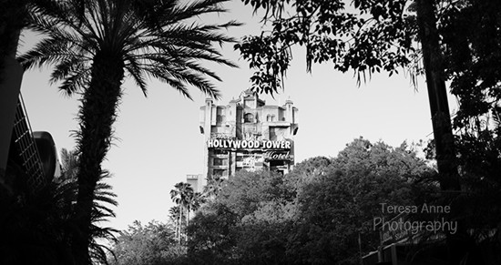
“In a photograph, the frame refers to the edges of the photo. It is the boundery of your scene and it leads your viewer to look at your photo within these bounderies. Now, if you add another frame inside your photo and place your main subject inside this frame, it will put more emphasis on your main subject. Placing your main subject inside a frame within a frame tells your viewers that your main subject is the focal point of your photo and they should focus their eyes on your main subject.”
You can frame your subject with whatever you want, but this particular picture worked well with the palm trees right outside of the Rockin’ Roller Coaster. The colors were beautiful and vibrant, but I thought black and white gave it a more sinister look.
f/stop: 2.8
shutter speed: 1/160
ISO: 100
mode: Manual
lens: 20mm f/2.8
#5: Contrast
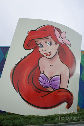
“Contrast can be achieved by having drastic difference in color or tone between the main subject and the background or supporting elements.”
In my photo, I used Ariel’s hair color as the contrasting element. It’s bright and vibrant, more so than all the other colors in the picture, and it pulls your eyes towards it right away. You can use color, texture, and shape to distinguish your main subject from other elements.
f/stop: 2.8
shutter speed: 1/320
ISO: 100
mode: Manual
lens: 20mm f/2.8
What do you think?
What’s your favorite rule? Which one do you use the most in your own pictures?
********************
And don’t forget about the awesome giveaway going on right now! You can win a camera strap for your DSLR camera with a pocket for your lens cap. Just visit here and fill out the form. Good luck!


I think we already know which is my favorite 🙂 Love using rule of thirds, but I also love using contrast to emphasize the subject!
haha how did I know you’d pick the rule of thirds? 😉 I love contrast as well, I just wish it had been a beautiful day out instead of overcast because I think it would’ve looked even better with a bright blue sky behind it. Oh well….
I actually don’t think I can pick a favorite out of the five. I love using them all, but for completely different reasons! 🙂