How to Choose the Best Fonts for Silhouette Projects
Choosing fonts for Silhouette projects can be tricky. There are so many different kinds to use, which one works for what type of project? We’re taking all the guesswork out of it and giving you all the tips you need to start picking the best fonts today.

Fonts are really fun to look for. Script fonts always catch my eye and I’m a sucker for a good bubble font.
But did you know that not all fonts are good for vinyl creations? And even more than that, did you know that you’ll cause yourself more frustration if you use the wrong one?
We’re going to cover everything from picking the right fonts that won’t give you a headache when you go to cut and weed them to installing them on your computer so you can access them in your software!
The past few years I spent a lot of time going down the rabbit hole on Creative Market to find fonts I liked.
The biggest issues you have to watch out for with fonts are:
- they’re too skinny OR
- they have lots of little distressed pieces that make cutting and weeding an absolute nightmare.
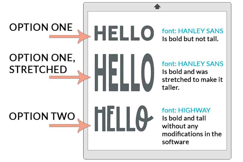
In addition to that, you have to watch out for the height and weight of fonts. If you need a tall font but the one you love is a regular sized font, it will not look good if it’s stretched.

So, with that in mind how do you pick the best fonts for your projects?
This post contains affiliate links. I may earn commission from qualifying purchases at no additional cost to you. I will never recommend a product I don’t use or trust.
3 Tips to picking the best fonts for your Silhouette projects
1. Find solid fonts.
There are lots of cool fonts that have a distressed look to them. They’re great and all but they are also a HUGE pain to weed.
These distressed fonts are fun to use if you’re doing things like invitations, business cards, printables, or even cover designs for social media. But if you’re cutting out a vinyl design they cause lots of problems and can be difficult to use if you’re a beginner.
My favorite solid fonts are:
2. Go with a fat font over a skinny one.
I love Skinny fonts. I’ve used them for multiple projects, my favorite being these Rae Dunn Inspired Christmas Ornaments.
But if you’re a beginner and still learning all the right cut settings, how to weed your vinyl without pulling your hair out, or aren’t sure if the font you like is easy to read…go with a fat font.
Fat fonts are easier to read close up and at a distance and are easier to weed. When in doubt I always choose a font that has more weight to it over one that’s skinnier.
My favorite fat fonts are:
- Hanley Font Bundle (it has lots of different font options that work for all kinds of projects)
- Tokyo Font
- Gibson Font– this is the font you’ll see that’s used on all the Starbucks cups. It’s similar to the one Starbucks uses!
3. Use fonts with personality.
Do not be afraid to use fonts that have a bit of personality to them. The right font will add to your finished design, not take away from it.
One of my favorite fonts that has a ton of personality is HeartlandRegular font from dafont.com. It’s free to download and fun to use!
I used it on these Valentine’s Day mailboxes and it really adds to the cuteness of them, don’t you think?

Where are the best places to find new fonts?
I have three go-to places to find fonts from:
- SoFontsy – I love this site because you can find fonts and SVG files along with a ton of other crafty things.
- The Hungry Jpeg – This site has a lot of $1 deals and freebies for fonts which is awesome. But I also really love their collection of modern and dingbat fonts.
- Creative Market – I feel like most people have either heard of this site or have bought stuff from it themselves. It has a little bit of everything so it’s very easy to get lost in all that they have to offer!
But what if you’re using the fonts for something other than vinyl designs?
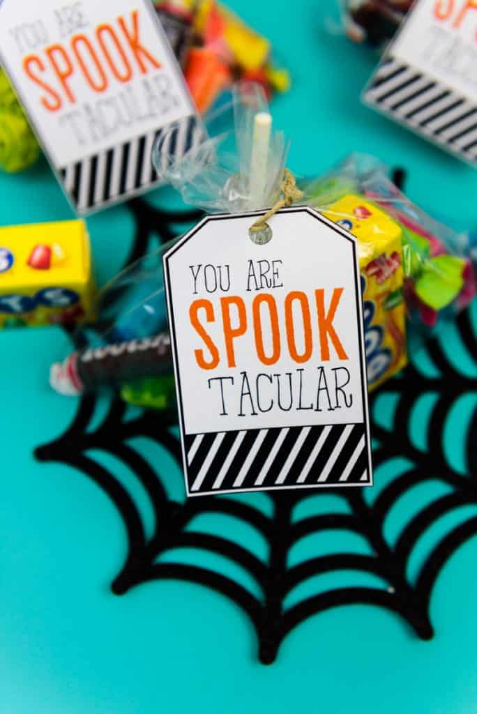
The one time where it doesn’t really matter if a vinyl is distressed or skinny is if you’re doing Print and Cut projects.
What’s print and cut? Well, that’s when you design something in the Silhouette software, send it to your printer, and then use your Silhouette to cut out the design.
I’ve used it a few times but the one that is super popular here on the blog are these Spooktacular Halloween Gift Tags.
This video explains how to set up Print and Cut in the software, it takes no time at all!
What fonts are best to use with the Silhouette Sketch Pens?
I really love using Skinny fonts for these types of projects.
But you have to make sure that they are single line fonts.
If you do not have a single line font chances are the pens will trace the outside of the letters and it will not fill in the blank space inside the letter.
Let me tell you, that does not look good on Christmas envelopes.
My favorite single line fonts are all from one shop (Single Line Fonts):
- SLF Industrial – perfect for a clean modern look this font is perfect for using when you need a more basic font.
- Single Line “Graceful” – this font is perfect for more elegant situations but it’s still very easy to read.
- Single Line Font “Handlettered” – I couldn’t go without mentioning a handlettered font! This is perfect for when your projects need a ‘it looks like I wrote it all out but I really made my Silhouette do it’ flair.
How do you open fonts in your Silhouette software?
First you need to download the font on to your computer.
Then follow the instructions to install it based on the operating system you have (I use both a Mac – OS software – and Desktop, both of which have two different methods for installing fonts.
If your Silhouette software is open you’ll need to save all the projects you’re working on and then close it out.
Open it back up and your fonts should be in there!
Picking out new fonts to use is fun but I have to warn you not to go overboard. I can’t tell you how many fonts I bought that I don’t even use anymore.
Also…stay clear of font bundles. They seem good now but you’ll soon figure out that you will never use all of them. It’s better just to buy a few that you love and will use all the time!


Thank you for all your tips. Love them.